Project Background
Flying Saucer is one of my favorite pubs to visit. They have a great community feel, a knowledgable wait staff, a constantly rotating tap, and a fun atmosphere. They have a very popular loyalty program with their regular customers called the UFO Club. The purpose of the club is for the member to try 200 different beers. Once a member reaches 200, they get a plaque on the wall of the pub and a party. There are other prizes along the way like discounts on beer or t-shirts.
The way the pub system tracks your beers is via an app that is frankly horrible. As a member myself, I find the system convoluted. There are too many pieces of information needed just to log in, the beer menu is hard to navigate and there are so many things that look like buttons but do nothing. This is an app for a bar and ease of use is paramount, especially the more the user drinks.
As a personal project, I wanted to imagine a new version of this loyalty app that would be easy to use but also lean into the pub's UFO theme.
The App Today
Today, the app is very basic looking and a bit outdated. Everything is in grayscale except for on the log in screen. A user can't sign up on their own, but must get a bartender or wait staff to bring them an application, which they fill out and return.
The server manually enters info into the POS system and the new member is given a card with a member number on it. These cards seem to be a relic of the program before the app and for some reason, the store seems to not be able to get rid of them. But the number on the back is required for log in.
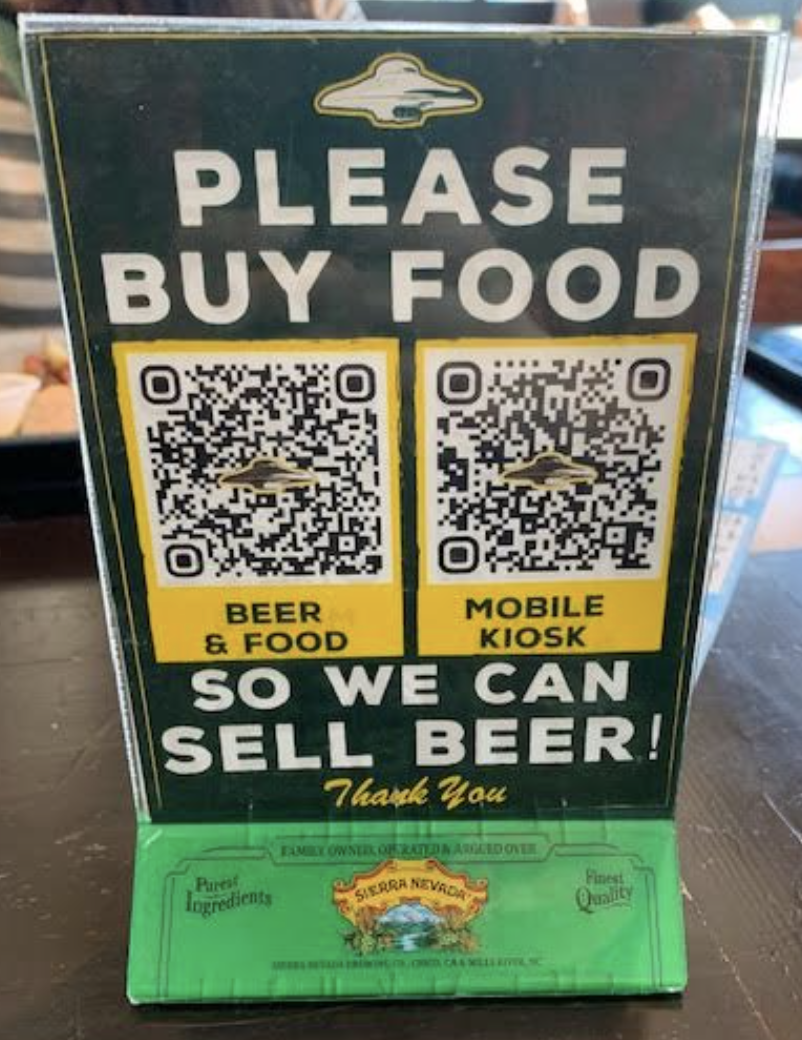
The app isn't a downloadable app, but rather a web app the the user accesses in the bar via a QR code:
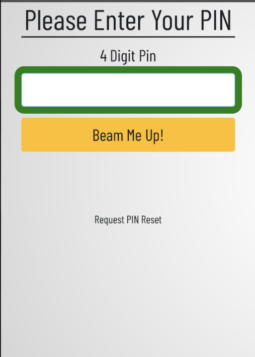
Once the QR code is scanned, the user is taken to a 2-step log in process.
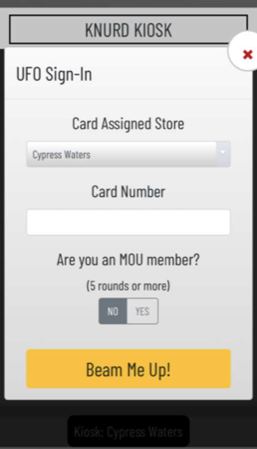
This is the only point in the process that the card is needed as the number is only on the membership card and nowhere else. I'm assuming that each card number is unique and that a home store can be associated with the number upon account creation. This could be to connect the queue within the app to the restaurants POS system. But without knowing for sure, I’ll assume it isn’t needed.
I decided to condense this process into a basic email/password login.
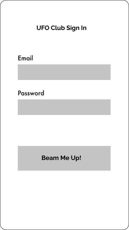
Wireframe Sign In
Once the user logs in, they are presented with a home screen.
None of the cards with the red headings are clickable. Since memberships are tied to a specific location, I’m unsure what the Saucer Memberships and Saucers Visited cards are for or how they are beneficial to the user. The copy in the progress bar is hard to read, and it took me a while to recognize it as a progress bar.
This app is meant to be used in-store so there could be fewer options here in order to get the user to the beer ordering stage faster. New Arrivals is already an option within Beer Finder, so unsure why it is a separate option on the home screen. I'm assuming it is really helpful to frequent repeat customers.

Wireframe
I chose to put the Saucer Membership, Saucers Visited, Member Since and Email Address under Account Info instead of separating them out on the landing page. This leaves the most important actions to the user easily visible on the home screen.
The beer ordering menu is fairly straightforward, although a bit dull looking. To choose a beer the user clicks on the list item and is presented with a pop-up modal describing the beer. They would then tap a large button to "Queue It Up" which sends their order to the bar POS system.


The search works well and the options for filtering seem intuitive. Some list items don't look clickable on first interacting with them. Clicking both “Beerfinder” and “Back” takes the user back to the Beerfinder screen.

Wireframe
Wireframe
UFO Club Re-Imagined
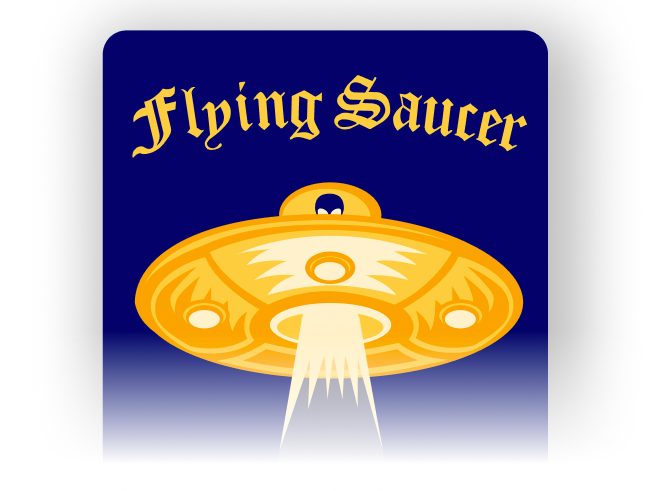
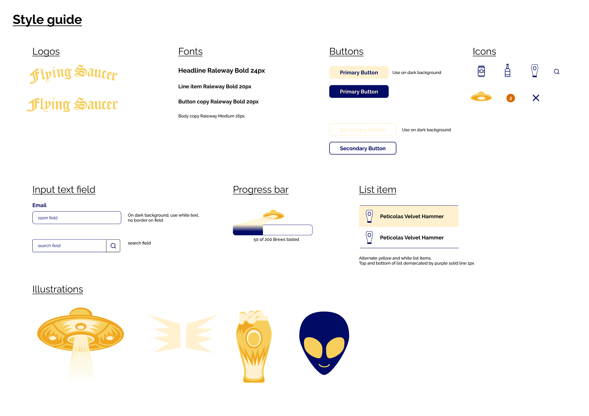
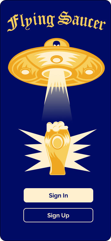
In my conceptual redesign, I really wanted to lean into the UFO theme. It would coordinate with the bar's current marketing materials and it would match the quirky, fun vibe that the bar aims for.
I went through many iterations of color combos, but knew I wanted to keep it bold and bright but also with enough contrast in colors that a customer with a buzz could still use it easily. I also went through many versions of the saucer illustration before I settled on the one for the home screen.
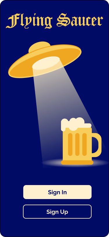

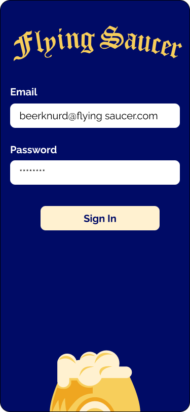
I simplified the log in process to just an email and password combo. This way, the user would not have to have their card with membership number with them and would not have to remember a PIN number. Since sign up must be done by an employee, the Sign Up button would trigger a notice to the POS system for the employee to bring a form, check ID, get payment, and discuss how membership works.
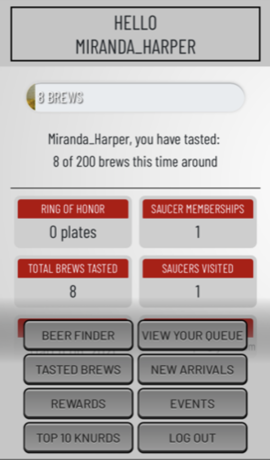
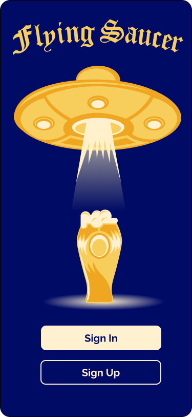
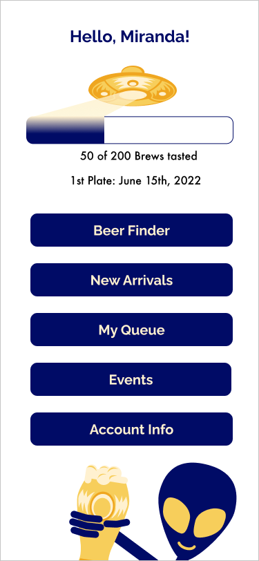
Once signed in, the user sees a simplified home screen with options clearly visible, a progress bar indicating how many beers they have already had and how many more are to go to get to their next plaque. If they have already earned a plaque, that is also shown here.
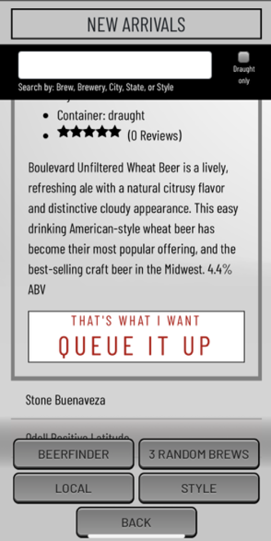
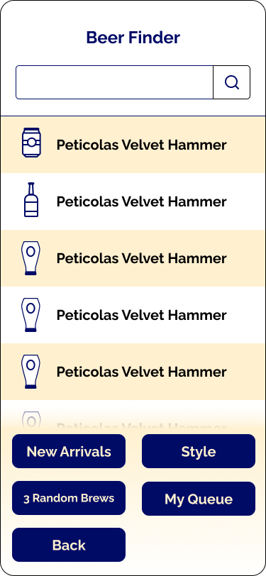
The Beerfinder menu is mostly the same, just with updated style changes. Some customers are picky about draft vs. bottled vs. canned beer and the container is indicated with an icon to the left of the beer name.
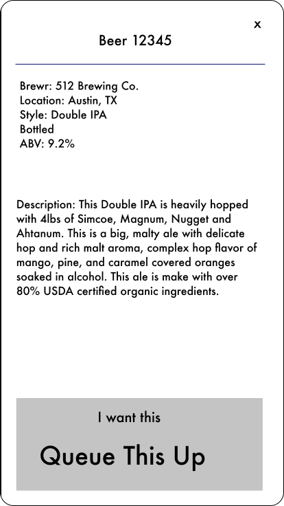
When the user taps a beer in the list, a pop-up modal opens with a beer description and the option to order it. Once the user taps Queue It Up, the order is sent to the bar's POS system and added to their loyalty club account. There is now a badge near the My Queue button to indicate that the order is in the queue for the customer.
Beer finder
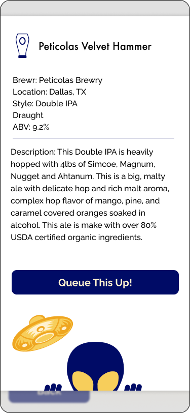
Beer description

Beer in queue
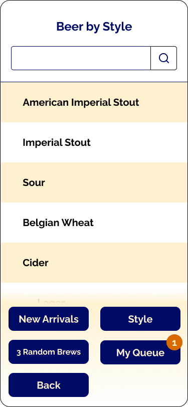
The user can also browse beers by style or location.


Prototype & Testing
I tested a prototype of this newly re-imagined experience on 2 bar goers. None had major problems and really liked the illustrations. One did say that he wished there was an easier way to remove an item from the queue. They were also a few beers in, so may be unreliable :)

